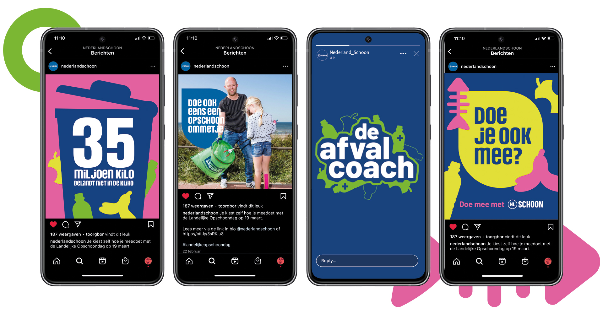
NLSchoon (Social style) redesign
For NLSchoon I redesigned the social style and content formats in combination with the strategy team -which created the right approach for NLSchoon on social media. The key take-out of the redesign & strategy was to get NLSchoon a knowledge authority in the field of litter. The redesign included, among other things, expanding a color palette, research into adding a font, developing a language of form and applying it in the concept formats.
Skills
Concept & Design with
Illustrator / Photoshop / Indesign
Agency
Blauw Gras
Client
NLSchoon
Date
2021 / 2022
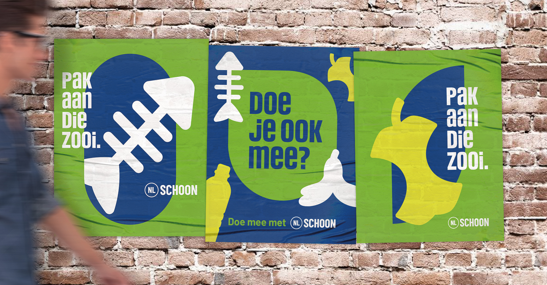
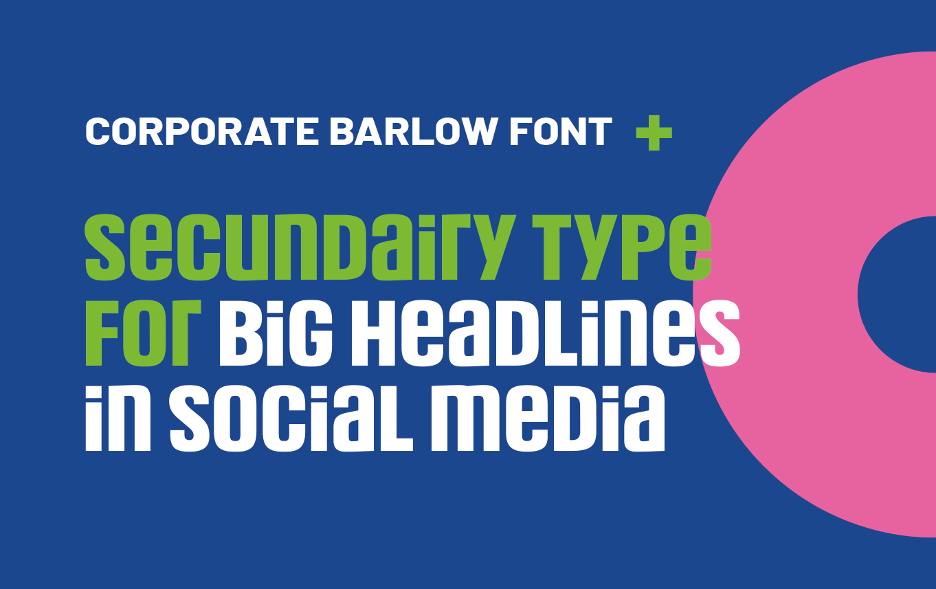
Addition of typography & color
The corporate design almost uses exclusively corporate typography. As a result, some expressions & messages are absorbed into the big picture. By adding a different type, it creates a different experience, which can connect well with the B2C target group.
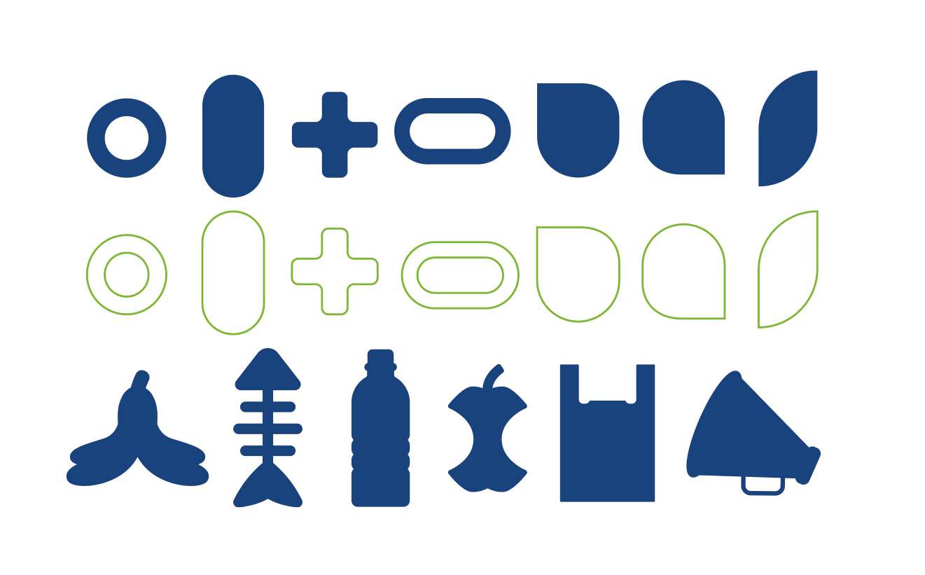
Addition of color and shapes
With the basic ingredients of NLSchoon’s corporate identity, I researched the addition of extra colors and a shape language specifically for social media to give certain concept more emphasis.
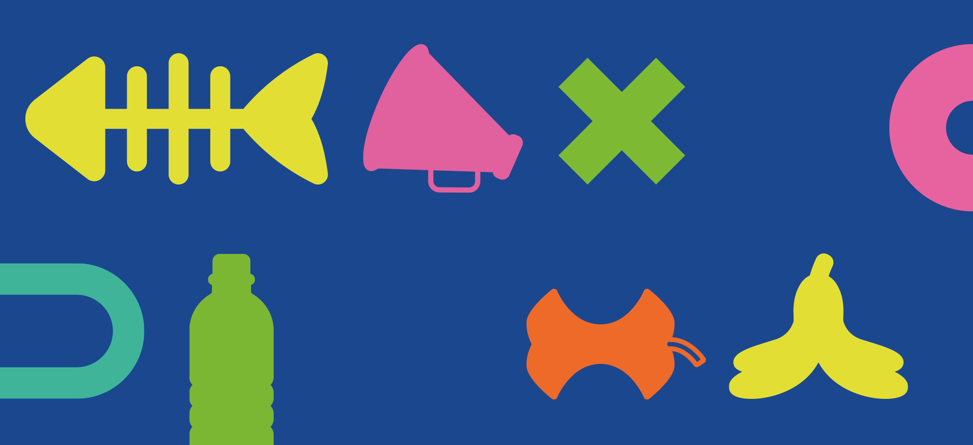
Use of shapes into formats
Through the design language & combination of new colors we create our own world of experience that can be used for both B2C and B2B.